
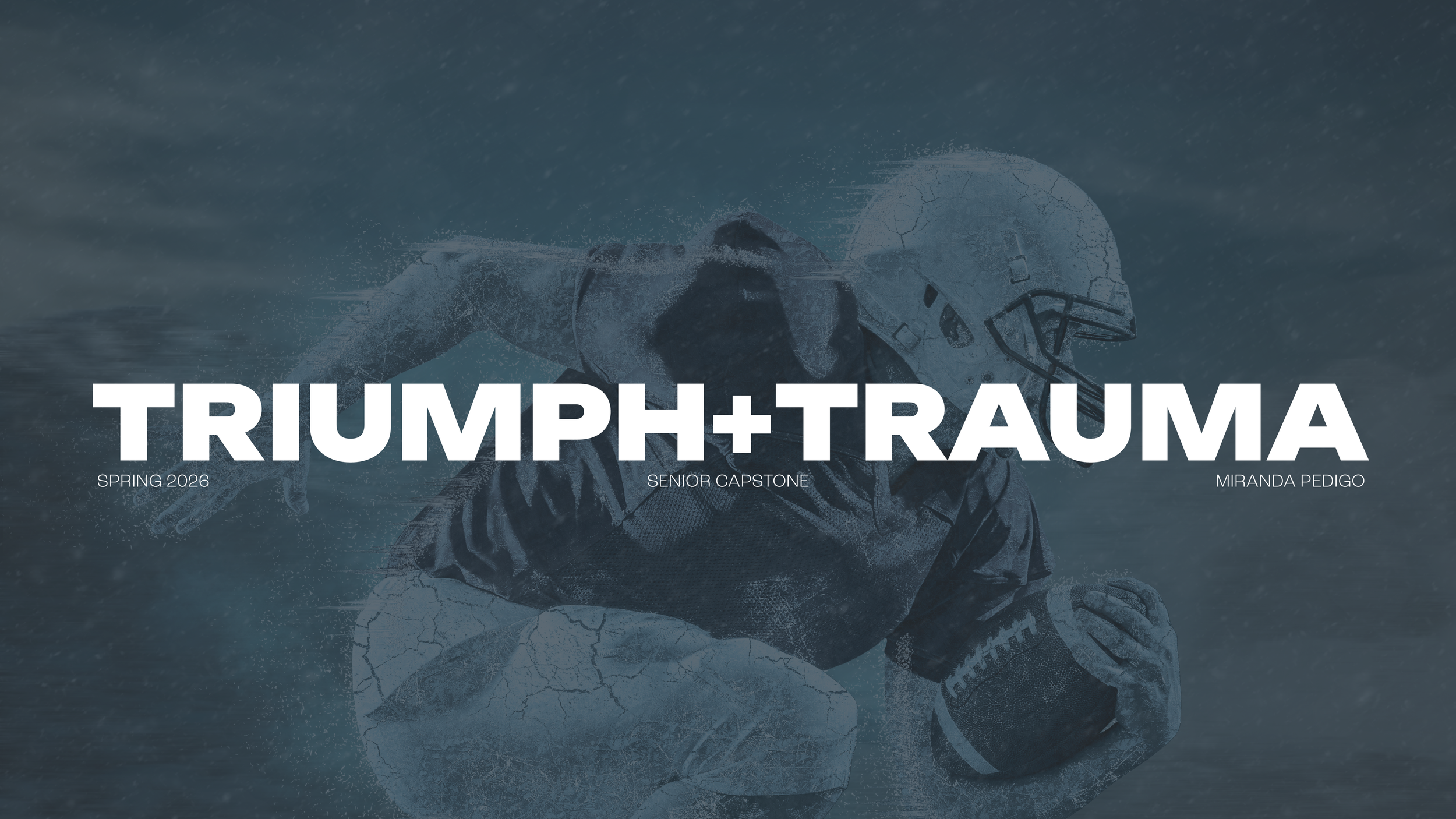
Senior Capstone Case Study
Bachelor of Fine Arts in Graphic Design
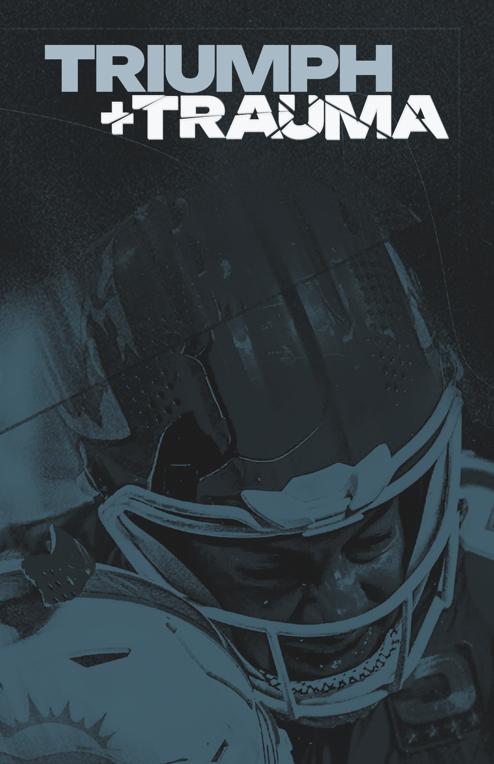
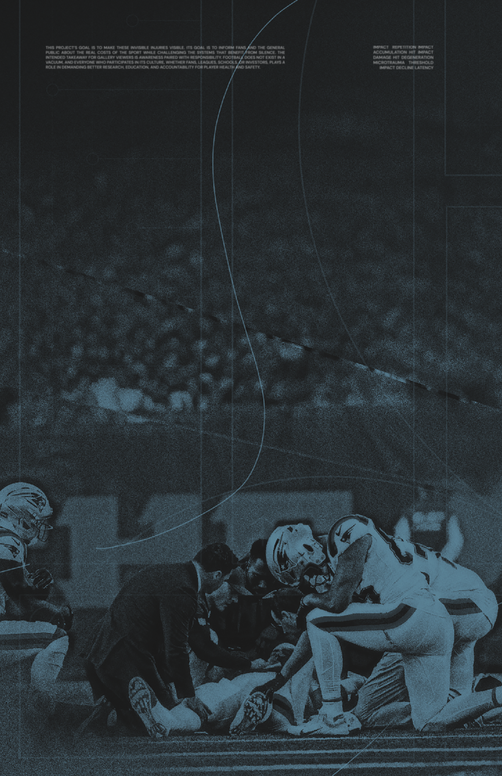
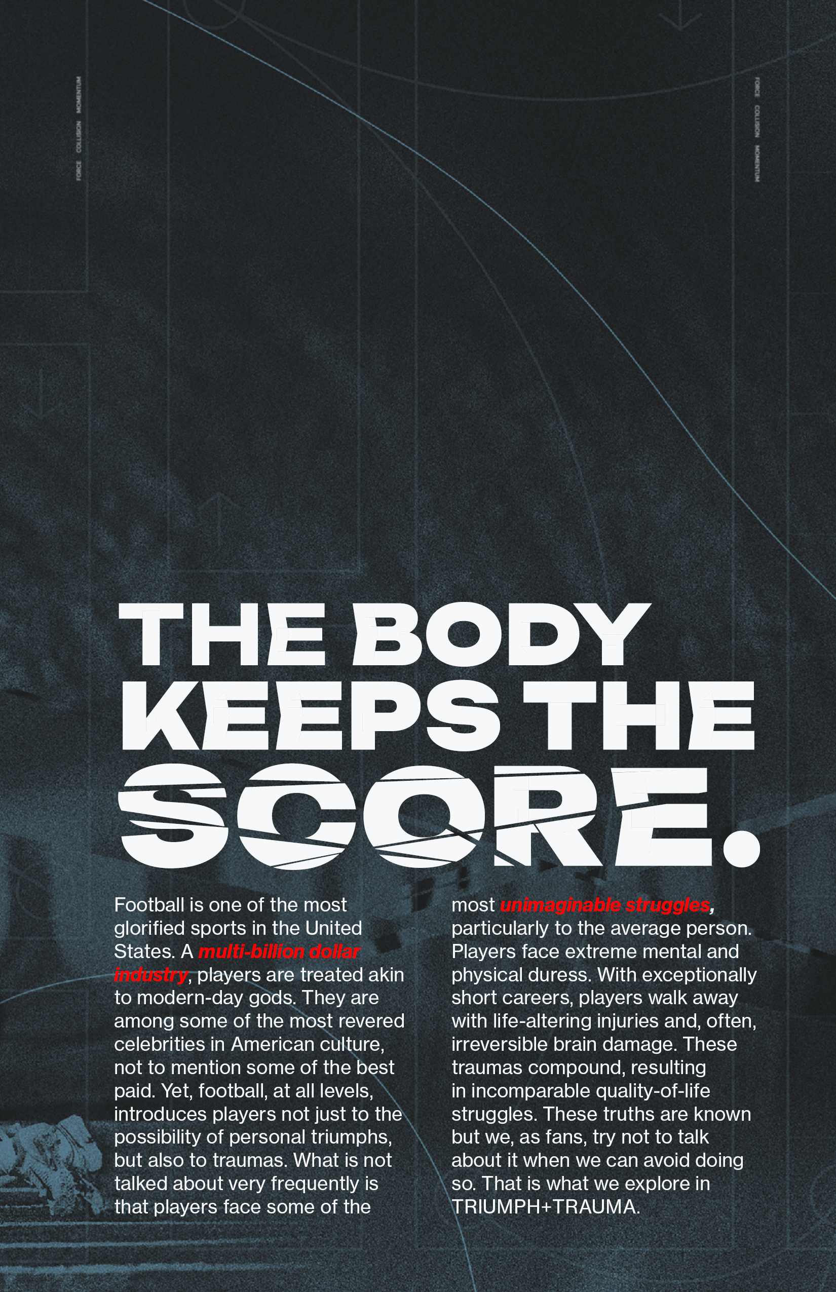
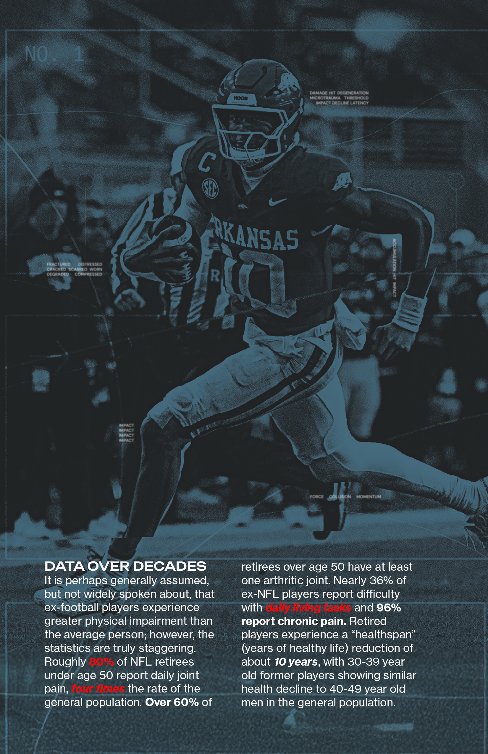
Triumph + Trauma is a multidisciplinary design project that examines the duality of American football, its cultural glorification alongside its often-overlooked physical, mental, and neurological consequences. The project translates complex medical and emotional realities into an immersive visual and experiential system, challenging viewers to confront the hidden cost of the sport.
The work exists across physical installation, digital design, and branded artifacts, creating a cohesive narrative that moves from attraction to discomfort, and invites the viewer to move to action.
-
The capstone prompt called for a comprehensive, self-directed design project that synthesizes research, concept development, and execution across multiple touchpoints. The goal was to demonstrate not only technical skill, but also the ability to communicate a meaningful message through a cohesive visual system.
For this project, I chose to explore:
The intersection of sports culture and bodily harm
The contrast between external glory and internal damage
How design can evoke empathy through sensory disruption
-
The core concept is built on juxtaposition:
Triumph (celebration, fandom, identity)
Trauma (injury, deterioration, invisibility)
Rather than presenting information passively, the project uses disorientation, distortion, and immersion to simulate the lived experience of athletes.
The strategy was to:
Draw viewers in with familiar sports aesthetics
Disrupt expectations through visual and sensory interference
Leave a lasting emotional impression rather than just conveying data
-
The project is intended to feel uncomfortable, thought provoking, haunting, to put the viewer in the place of the player, to make the experience of physical and mental degradation visceral.
The tone aims to be:
Heavy · Uneasy · Sobering · Tense · Quietly violent · Uncomfortable · Clinical but human · Cold truth · Weighty · Inescapable · Subdued · Controlled · Disturbing without spectacle.
Visual Identity System
Typography
The typography pairing plays a central role in communicating the project’s duality.
Unbounded Black (Headings & Logo)
Chosen for its bold, expanded, and highly assertive presence, Unbounded Black reflects the spectacle and dominance of football culture. Its exaggerated width and weight create a sense of impact and pressure, visually echoing both physical collisions and cultural intensity.The rigidity of the letterforms also contributes to a feeling of control and authority, reinforcing how the sport is marketed, powerful, structured, and larger than life. Select characters have unexpected bends and angles, reflecting the idea of damage and impact.
Neue Haas Grotesk (Body Copy)
Used for body text to provide clarity, neutrality, and credibility. Its roots in Swiss design bring a sense of clinical objectivity, which contrasts intentionally with the emotional weight of the subject matter.
Color & Material Choices
The palette centers around dark, desaturated tones with controlled use of contrast:
Deep blacks and muted blues evoke bruise-like coloration
Mid-tone grays reference institutional and clinical environments
High contrast moments (white, unexpected reds, and yellow) guide attention and heighten emotional impact
Material choices reinforce this:
Matte finishes absorb light, creating heaviness
Distressed and altered surfaces suggest wear, damage, and time
The photo treatment aims to create separation between reality and the imagery, as well as to visually mimic degradation and the experience of injury and confusion.
Key Components
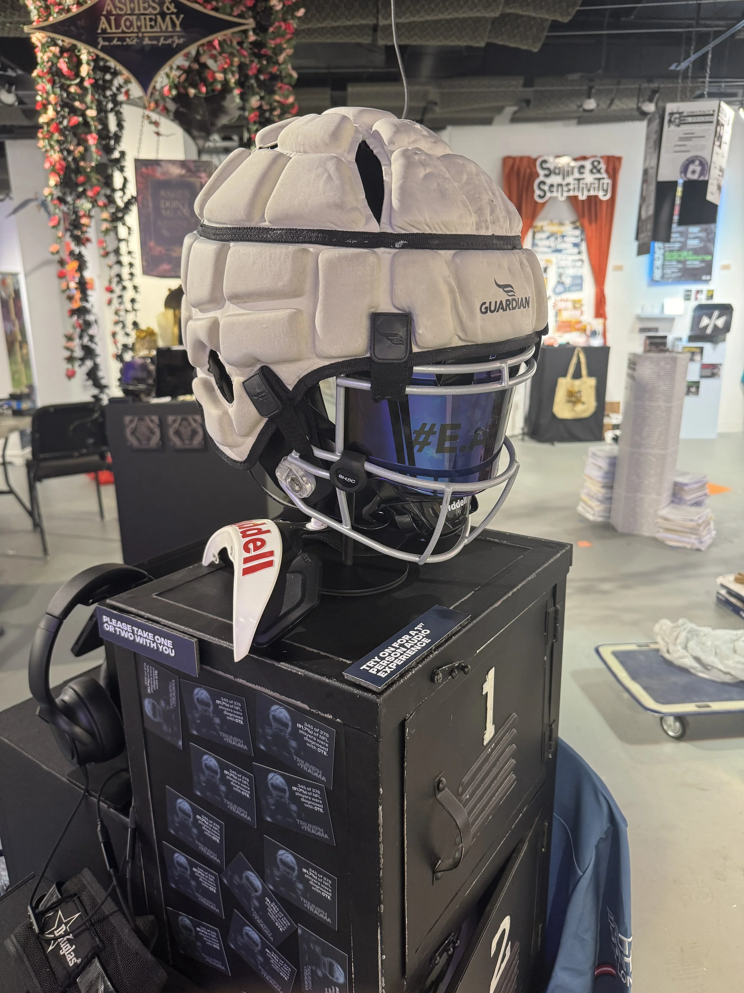
Immersive Helmet Experience
A football helmet serves as a focal artifact, equipped with audio that walks the listener through the physical and emotional experience of a concussion.
Design Intent:
Transform a symbol of protection into a vessel of vulnerability
Force a first-person perspective
Use sound to create discomfort that visuals alone cannot achieve
The helmet bridges the gap between object and experience, making the invisible tangible.
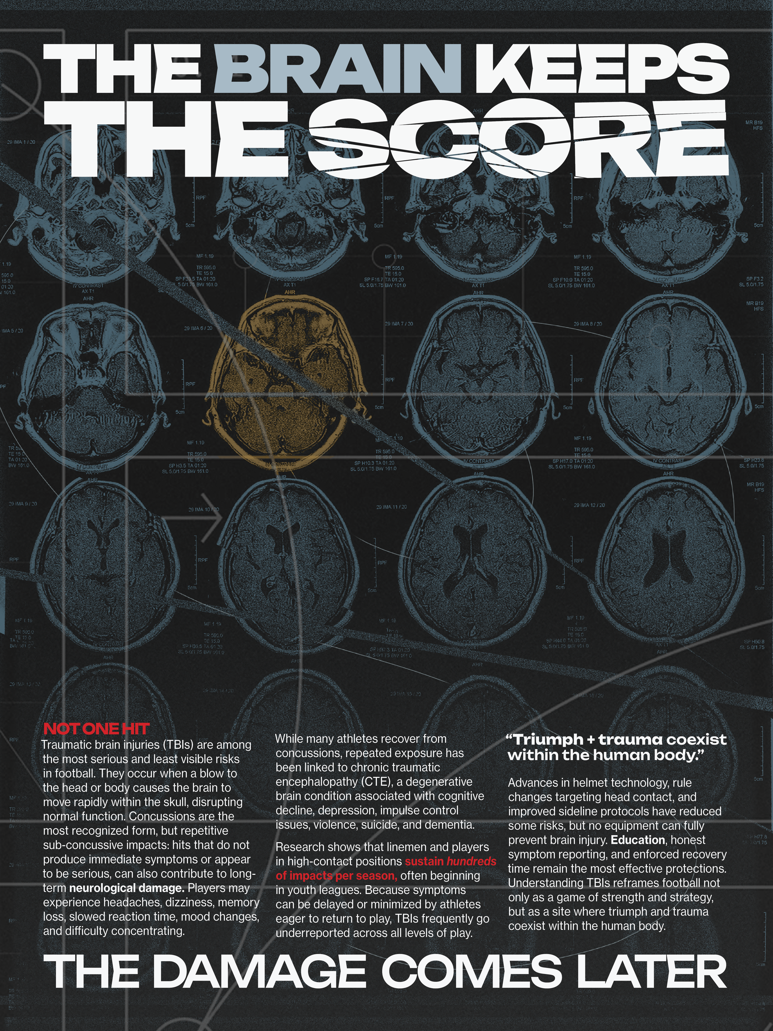
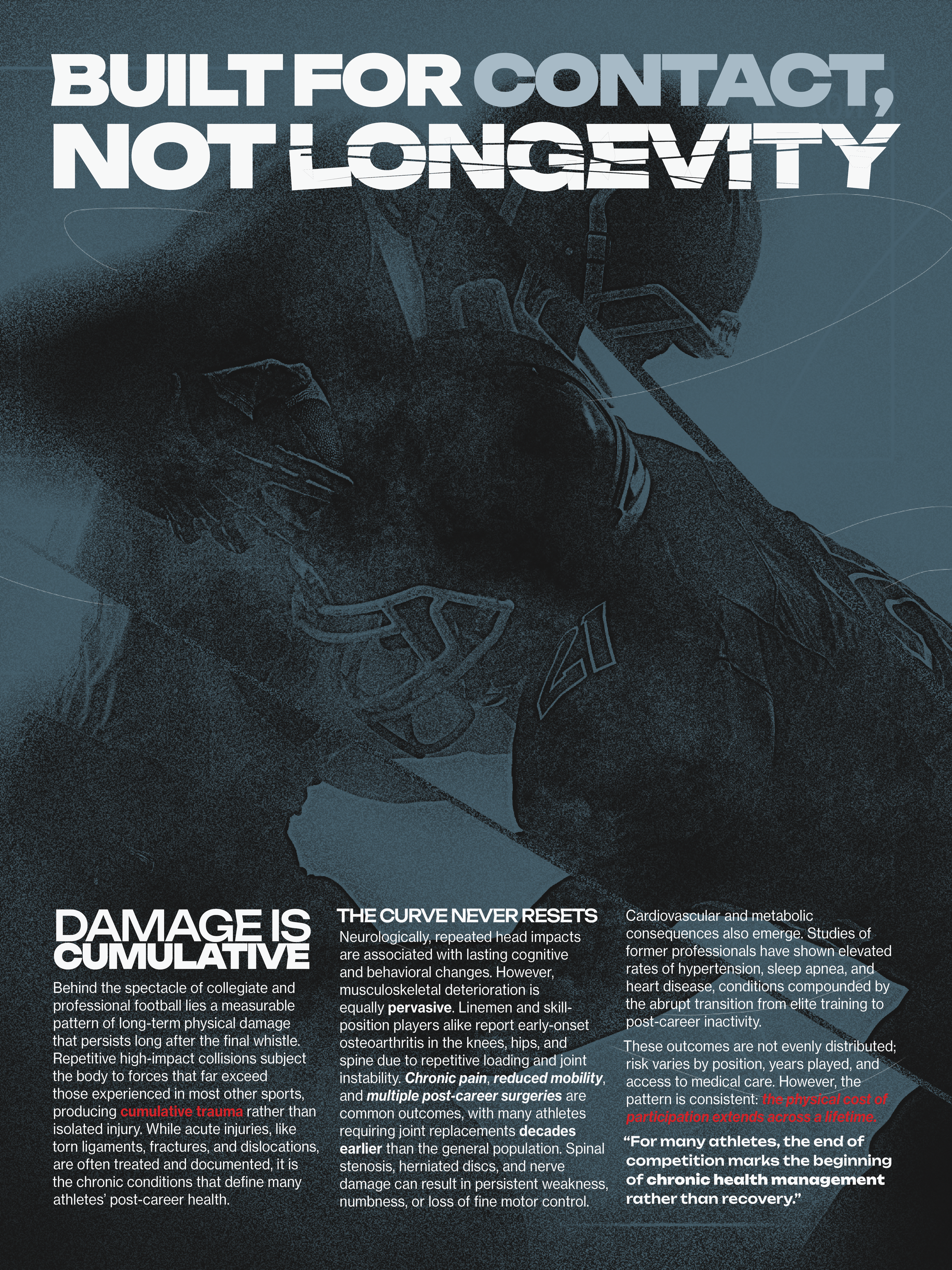
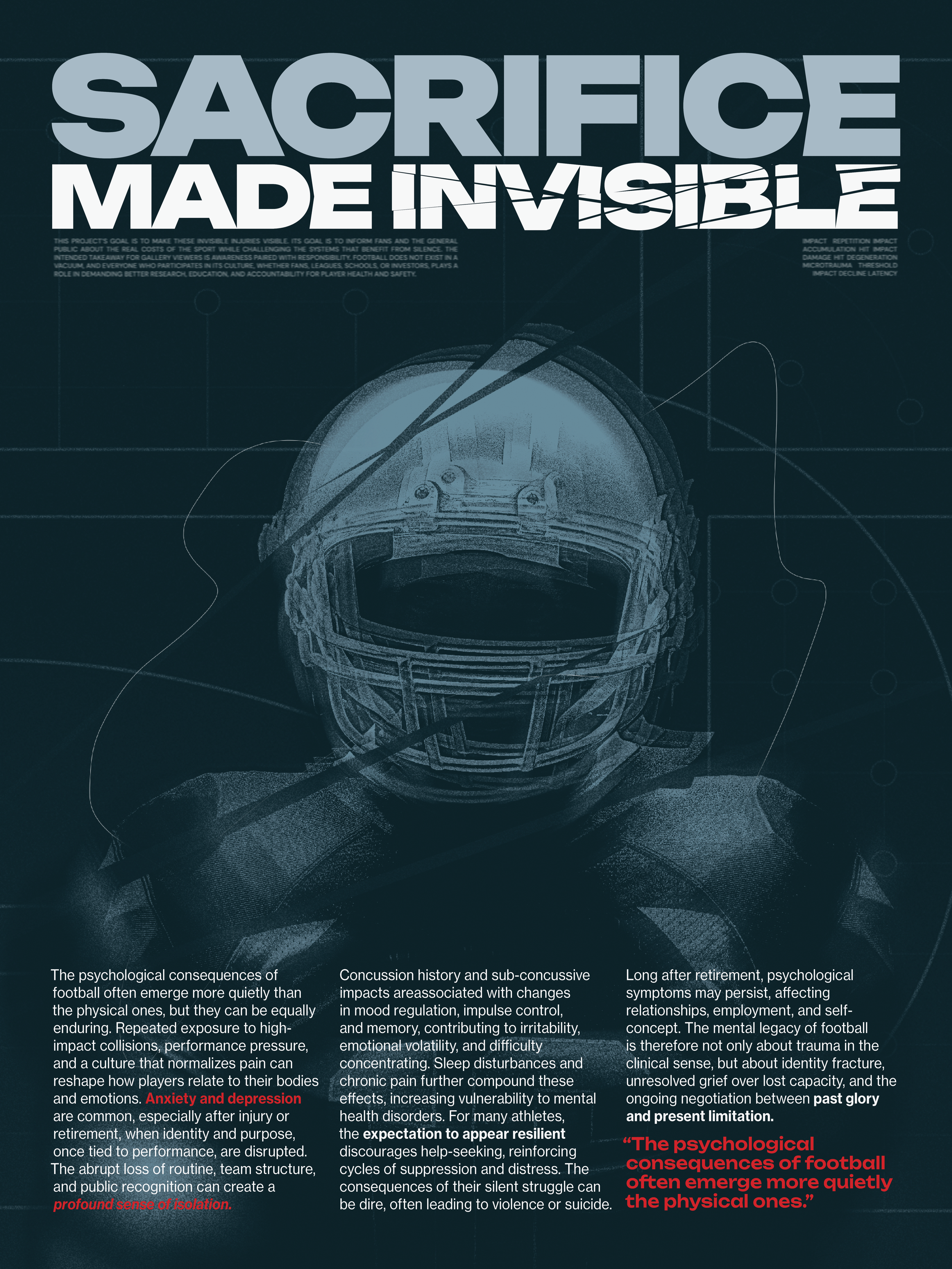
Informational Poster Series
A series of large-format posters communicates key research findings related to physical injury, neurological damage, and long-term consequences.
Design Intent:
• Provide clear, evidence-based information
• Anchor the exhibition with moments of structured clarity
• Balance emotional content with factual credibility
Design Approach:
• Structured grid systems evoke clinical and institutional design
• Selective disruption through glitching typography and fragmented imagery
• Controlled color palette maintains a somber, authoritative tone
The contrast between order and distortion reflects the tension between the sport’s perceived structure and its underlying physical consequences.
Interactive Player Timelines (iPad Experience) - VIEW
Six interactive iPad timelines present the lived experiences of individual football players,
tracing their paths from early success through injury, long-term effects, and post-career realities.
Design Intent:
• Humanize statistical data through personal narrative
• Shift the experience from observational to empathetic
• Reinforce the cumulative nature of trauma over time
Design Approach:
• Linear timeline structure mirrors inevitability and progression
• Use of player imagery that degrades as one follows the timeline.
• Glitching experience as viewer moves further along timeline, reflecting the cumulative
nature of physical and mental trauma.Audio Integration:
Each timeline includes embedded audio accounts, allowing users to hear disorientation,
pain, and emotional struggle firsthand.
Purpose:
• Add a sensory layer beyond visual communication
• Simulate cognitive disruption through fluctuating audio clarity
• Create a more immersive, first-person connection to the content
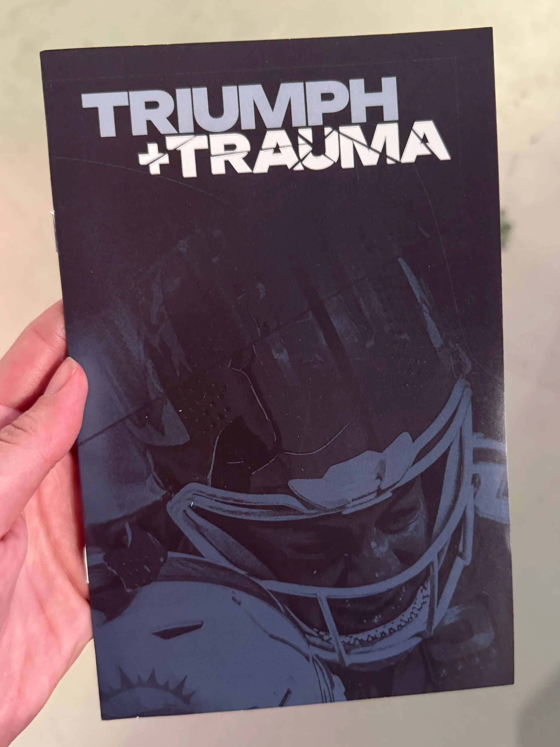
Informational Zine
The zine functions as a portable extension of the exhibition, translating the installation into an intimate, take-home format.
Design Intent:
• Extend engagement beyond the gallery space
• Allow for deeper, self-paced interaction with the content
• Create a tactile connection to the subject matter
Design Approach:
• Content sequencing mirrors the exhibition narrative
• Consistent typography reinforces the overall identity system
• Compact format enables denser information and reflective pacing
Material choices emphasize tactility and rawness, reinforcing the project’s unpolished and honest tone.
Spatial Design & Environmental Installation
The exhibition space is designed to evoke a degraded locker room environment,
transforming a space associated with preparation and pride into one of
deterioration and aftermath.
Key Elements:
Degraded Black Locker
A central locker, altered with distressed black finishes, acts as both sculptural object
and functional pedestal.
Purpose:
• Symbolize long-term neglect and physical decline
• Subvert the traditional locker room as a space of strength
• Create a focal point within the installation
Degraded Football Gear
Used helmets, pads, and equipment are placed throughout the space and within the locker.
Purpose:
• Ground the project in tangible, real-world artifacts
• Visually communicate wear, repetition, and impact
• Reinforce authenticity and emotional weight
• Encourage viewer interaction with the space, exploration of the lockers
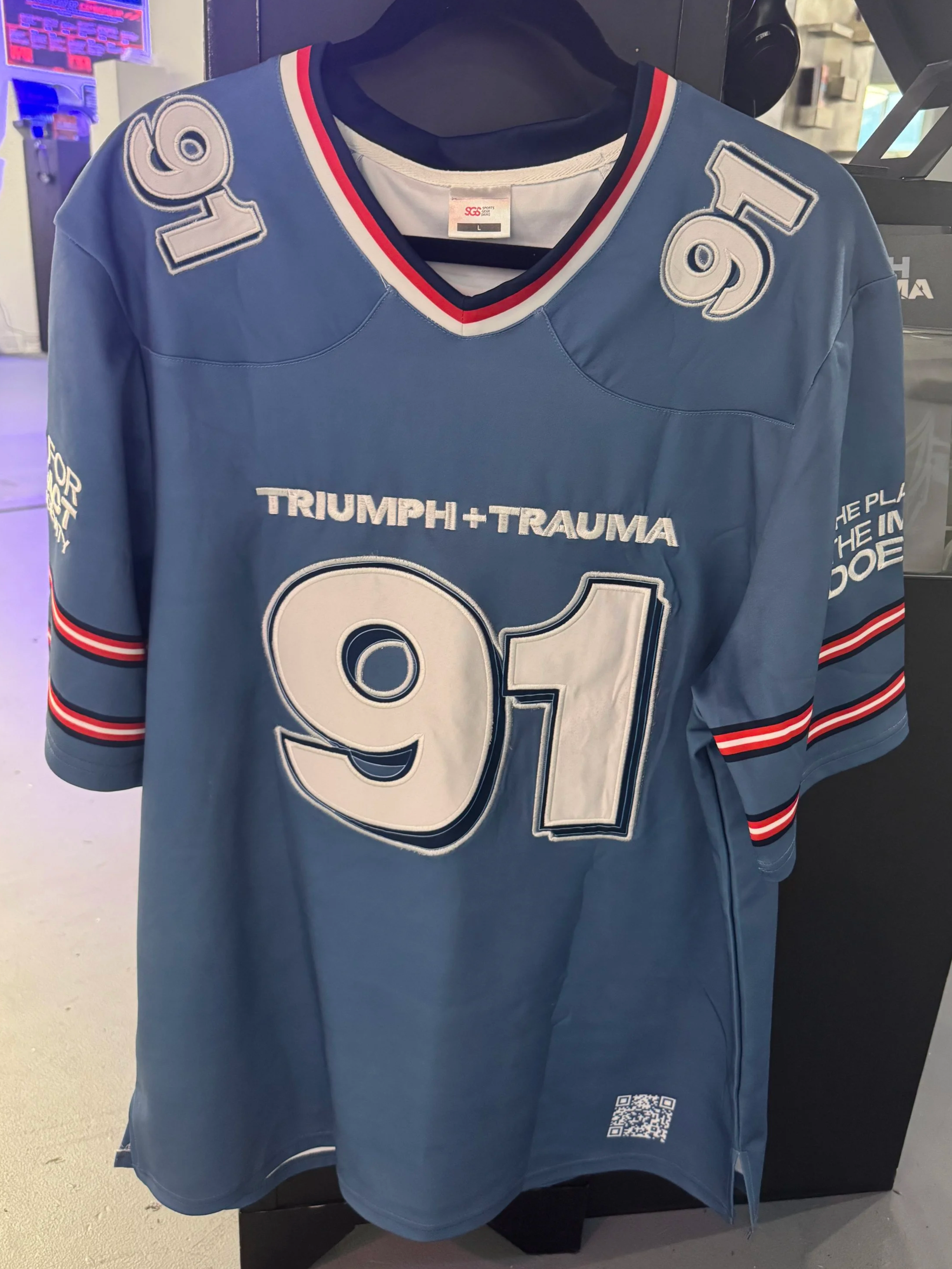
Branded Professional Jersey Prototype
A custom-designed football jersey featuring the Triumph + Trauma identity system,
produced as an authentic, professional-grade artifact.
Purpose:
• Bridge the gap between professional sports aesthetics and critical commentary
• Subvert the visual language of team pride by embedding themes of injury and
long-term damage (use of #91 references the statistic that 91% of deceased NFL
players were found to have CTE)
• Use familiar jersey typography, numbering, and placement to create immediate
recognition before revealing deeper meaning
• Position the project within a real-world context, suggesting how
these conversations exist within the industry itself
Pedestal Displays & Takeaways
Three pedestals present branded takeaways:
• Temporary tattoos
• Buttons
• Magnets
• Koozies
Design Intent:
• Mimic the language of sports merchandise and fan culture
• Encourage participation while embedding a critical message
• Extend the project beyond the gallery space
The inclusion of koozies specifically references tailgating and drinking culture, introducing critical messaging into an object associated with celebration. This creates cognitive dissonance, reinforcing the tension between enjoyment of the sport and its consequences.
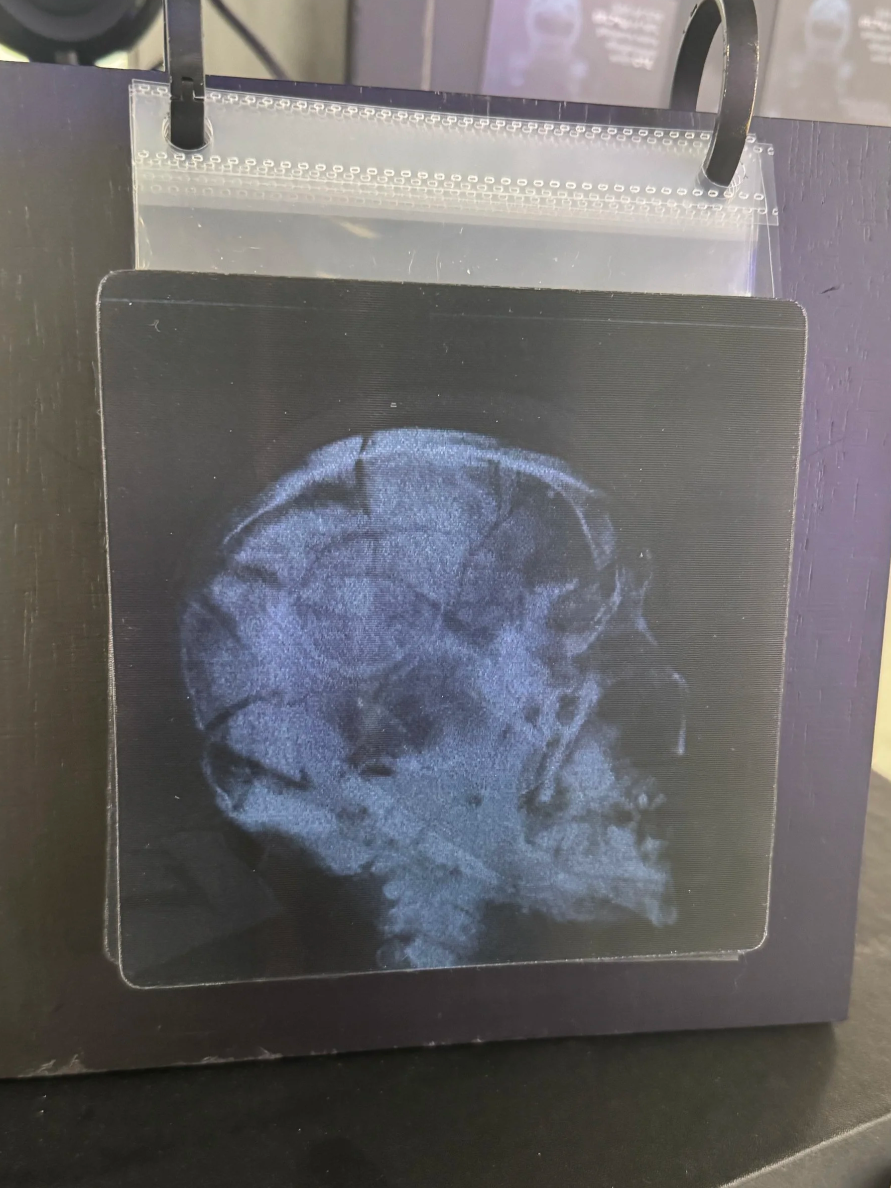
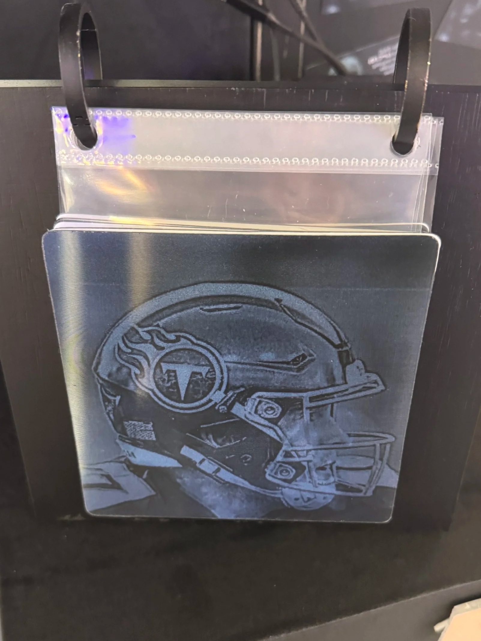
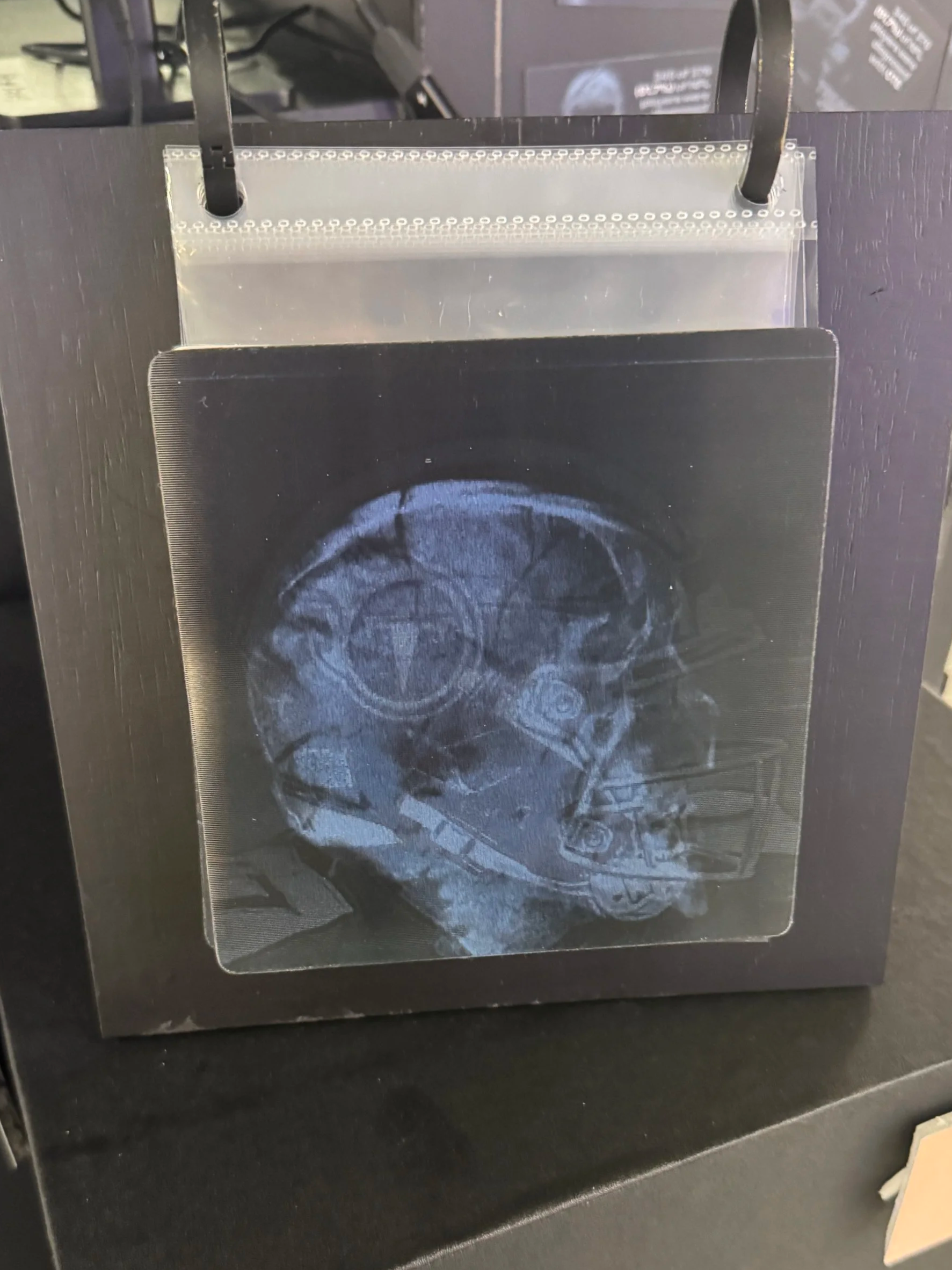
Lenticular Print Series
A series of lenticular prints presents dual-image comparisons that shift as the viewer moves.
Content Includes:
• Healthy brain vs. advanced CTE degeneration
• Suicide rates with CTE vs. without
• Perception vs. long-term reality
Design Intent:
• Require physical movement to fully perceive the image
• Present conflicting realities within a single frame
• Create moments of visual shock and instability
Glitching Logo Projection
A projected, animated version of the Triumph + Trauma logo that intermittently distorts,
flickers, and breaks apart across the exhibition surface.
Purpose:
• Visually simulate cognitive disruption and neurological instability associated with repeated head trauma
• Contrast the polished, static branding with an unstable, deteriorating digital presence
• Extend the identity system into motion, reinforcing the concept of breakdown over time
• Create an immersive, ambient layer that subtly unsettles the viewer and activates the surrounding space